Neon-Dipped Planters: Bold Porch Style, $20
Natural terra cotta on top, electric neon on the bottom, and absolutely zero apology for either choice.
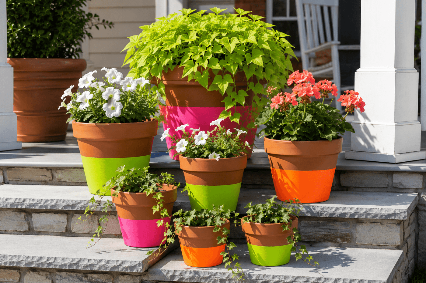
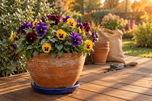
The porch planter situation at most houses falls into one of two categories: the terracotta pots that have been sitting there since the previous owners left them, and the beige plastic ones from the big box store that came with the tomato plants three summers ago. Both are fine. Neither is the kind of thing that makes someone slow their car down as they drive past your house. Neon color-dipped planters are the kind of thing that makes someone slow their car down. The technique is painter's tape and two colors of outdoor paint — natural terra cotta or bright white on top, electric neon on the bottom third — applied in graduated sizes across five to seven pots and clustered on porch steps or a patio corner for the kind of massed color impact that reads as genuinely bold and deliberately designed rather than accidentally cheerful. Electric pink, lime green, bright orange, shocking yellow — each pot in its own color, each plant chosen to either contrast the neon or let it completely steal the show. This is the Sassy Saturday project that costs $15–25, takes about two hours, and makes your outdoor space the most visually confident one on the street by the time you're done.
What You'll Need
- Terra cotta pots in graduated sizes — 4", 6", 8", 10", and 12" makes a compelling cluster; terra cotta's warm orange tone plays beautifully against neon colors and requires no base coat for the natural upper portion (~$1–4 each depending on size)
- Neon outdoor paint — choose 3–4 colors:
- Electric pink — Rust-Oleum Fluorescent Pink or DecoArt Neon Pink
- Lime green — Rust-Oleum Fluorescent Yellow-Green
- Bright orange — Rust-Oleum Fluorescent Orange
- Shocking yellow — Rust-Oleum Fluorescent Yellow
- Small sample or craft sizes cover multiple pots; spray paint produces the smoothest neon finish on curved terra cotta surfaces (~$4–6 per color)
- White spray paint primer — one coat under neon paint on terra cotta; neon pigments are notoriously low in opacity and require a white base to achieve true vibrancy rather than a muted, washed-out version of the intended color (~$5–6)
- Painter's tape, 1-inch — FrogTape for the sharpest color boundary line on curved terra cotta surfaces; applied at the exact dip line before priming and painting the lower portion
- Exterior clear coat sealer — two coats over the finished neon sections; neon pigments fade faster than standard colors in UV exposure and sealer significantly extends vibrancy through a full outdoor season (~$6–8)
- Sandpaper, 220-grit — for lightly scuffing any previously sealed or glazed pots; raw terra cotta accepts paint without sanding
- Drop cloth or cardboard — for protecting the work surface during spray painting; neon spray paint overspray travels farther than standard colors and stains permanently
- Plants — choose for maximum contrast:
- Simple green trailing — sweet potato vine, pothos, or trailing ivy lets the neon color be the visual star
- White flowering — white petunias or alyssum against neon pots creates the boldest contrast
- Matching brights — coral geraniums in a lime pot, hot pink million bells in an orange pot for maximum color confidence
How to Do It
- Clean all pots thoroughly inside and out with a damp cloth and allow to dry completely — at least two hours for raw terra cotta, which is porous and holds moisture longer than it appears to on the surface. Paint applied to damp terra cotta bubbles and peels within days because the moisture escaping through the pot wall pushes the paint film outward from below; completely dry terra cotta is the foundation the entire project's longevity rests on.
- Plan your dip line position on each pot before applying any tape — the most visually effective dip line sits at one-third to one-half of the pot height from the bottom, which leaves enough natural terra cotta showing above to create genuine contrast rather than a thin stripe of natural color at the rim. Hold each pot at arm's length and mark the dip line height with a light pencil mark before taping; a line that looks proportional in hand often reads differently from a few feet away where the finished cluster will be viewed.
- Tape the dip line by wrapping painter's tape firmly around the pot at the marked height, pressing the lower tape edge down firmly with a fingernail or credit card at every point around the circumference — on a curved surface like a tapered terra cotta pot, the tape naturally wants to lift slightly at the lower edge as it follows the curve, and this lifting is precisely where paint bleeds and the crisp dip line becomes a wavy one. Apply the tape in short overlapping sections on smaller pots rather than one long pull that bridges the curve.
- Prime the taped lower section with white spray paint, holding the can 10–12 inches from the surface and applying one even coat from the tape line down to the pot bottom — white primer under neon paint is the non-negotiable step that separates a neon dip that glows like a highlighter from one that looks like a faded approximation of the color on the can lid. Neon pigments have genuinely poor opacity and cannot overcome the warm orange tone of terra cotta without a white base; skip the primer and the finished neon will look brown-tinted and flat regardless of how many coats are applied.
- Apply neon paint in two to three thin coats over the cured white primer, allowing each coat to dry fully before the next — thin coats of neon spray paint dry faster, cover more evenly, and produce more saturated color than one heavy coat that runs at the tape line and takes twice as long to dry. The color should appear fully opaque and vibrant after the second coat on a white primer base; a third coat adds depth and richness that makes the neon genuinely electric rather than merely bright.
- Peel the painter's tape while the final coat is still slightly tacky — pull slowly at a consistent 45-degree angle back over itself, maintaining even tension along the full tape length rather than pulling in short jerks that risk tearing the paint at the boundary. The reveal of a crisp neon-to-terra-cotta line is the most satisfying moment in this entire project; a clean tape removal after correctly applied and slightly tacky paint produces an edge so sharp it looks like the pot was manufactured that way.
- Touch up any bleed spots at the dip line with a small artist's brush and the appropriate color — neon paint touch-ups on a white primer base blend seamlessly when applied before the main coat is fully cured, and addressing bleed immediately produces a cleaner result than waiting for full cure and trying to correct over a hard paint edge. Allow all touch-up work to cure fully before sealing.
- Seal the neon sections with two coats of exterior clear sealer — UV-resistant formula specifically, since neon pigments are fluorescent dyes rather than standard pigments and are significantly more vulnerable to UV fading than conventional outdoor paint colors. Apply the first coat, allow full cure, and apply the second; the sealed neon should maintain full vibrancy through an outdoor season that an unsealed neon pot begins visibly fading within six weeks of sun exposure.
- Cluster the finished pots in a grouped arrangement on porch steps or a patio corner — odd numbers of pots always read as more visually dynamic than even numbers, and varying heights within the cluster by combining different pot sizes creates the layered, intentional look that makes a grouped planting feel designed rather than merely collected. Place the largest pot at the back-center of the cluster, medium pots flanking it, and the smallest pots at the front corners where they frame the arrangement without blocking the larger pots behind them.
Visual merchandisers and garden stylists who design high-impact outdoor displays for retail and editorial photography use one color editing rule for multi-pot neon groupings that prevents the arrangement from reading as chaotic rather than boldly curated: limit the cluster to a maximum of three neon colors, and repeat each color at least twice across the pot grouping rather than using every color only once. A cluster of seven pots in seven different neon colors overwhelms the eye and produces visual noise rather than visual impact — the same seven pots in three colors with each color appearing two or three times creates rhythm, repetition, and the sense of intentional curation that makes a bold color grouping read as designed rather than random. Garden stylists who shoot for shelter magazines consistently use the rule of three colors maximum with deliberate repetition as the structure that allows genuinely wild color choices to read as confident and sophisticated rather than chaotic — because repetition is the signal to the eye that a pattern is intentional, and pattern is what separates bold design from a mess.